
Following up previous post introducing how to get Open Source development data, it’s time to play with them. I’ll use Pandas, the Python Data Analysis Library as main tool in this post.
Playing with data
Let’s create a simple data frame with information about the files touched in each commit. The script could look like this:
import numpy as np
import pandas as pd

from perceval.backends.core.git import Git
data_repository = Git(uri='https://github.com/grimoirelab/perceval.git', gitpath='/tmp/perceval.git')

df = pd.DataFrame()

for commit in data_repository.fetch():
    for file in commit['data']['files']:
        df = df.append({'author': commit['data']['Author'],
                        'commit': commit['data']['commit'],
                        'date': commit['data']['AuthorDate'],
                        'file': file['file'],
                        'added': int(file['added']) if 'added' in file.keys() and file['added']!='-' else 0,
                        'removed': int(file['removed']) if 'removed' in file.keys() and file['removed']!='-' else 0},
                       ignore_index=True)

df['date'] = pd.to_datetime(df['date'])
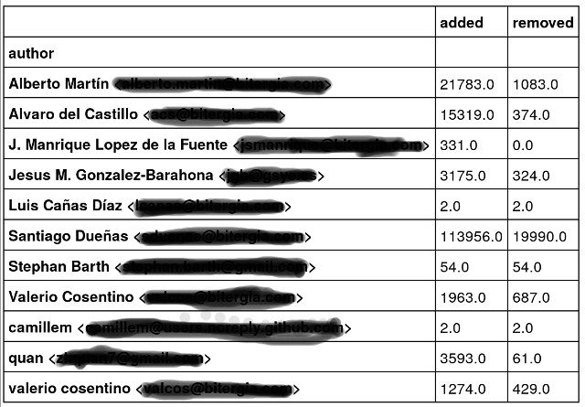
To get a list of the authors with total number of lines added or removed by each one’s commits, it would be something like:
df.groupby(['author']).sum()
If you use Jupyter notebooks to play with Python (and if you don’t use it, this is the time to start with it!), you might get a table like the following one:
How would you get the list of files with the mean of lines of code added or removed by commits? Easy:
df.groupby(['file']).mean()
What about the average number of lines of code added or removed in each file by each author’s commits?
df.groupby(['file','author']).mean()
I little bit more complex: How could I know the number of commits by each author on each file?
df.groupby(['file', 'author'])['commit'].nunique()
Isn’t Pandas amazing?
Plotting data
But, if you want to go further, plotting is your next natural step. And Pandas + Jupyter notebooks are very useful to start plotting data.
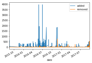
If you want to plot lines added and removed evolution, it would something like:
%matplotlib inline
df.set_index(['date'],inplace=True)
df.plot()
You would obtain something similar to this figure:
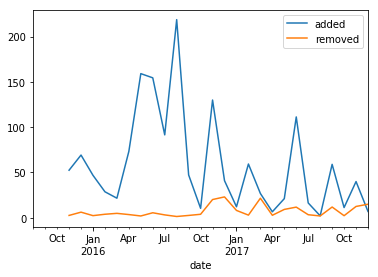
How about grouping that by month and the average number by each month? Easy:
df.resample('M').mean().plot()
To get:
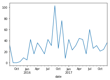
And, the typical question when we talk about git repositories: What is the number of commits by month?
df.resample('M')['commit'].nunique().plot()
You’ll get:
Easy, isn’t it?
What’s next?
If you have read carefully, you’ve seen that for example some authors seem to be repeated (check valerio) because they are using different email accounts or even different names. How could we massage the data to have unique identities?
We’ll deal with it in a following post..
Meanwhile, you can try similar these procedures with other data sources: Discourse, Slack or Meetup groups.
Share here your experiences and the issues you’ve found!
One Reply to “Analyzing Open Source development (part 2)”